15 July 2016
Are we seeing the last of Barry Scott?
Read More

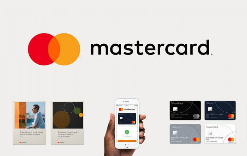
That rather well-known design agency Pentagram is helping to bring Mastercard’s iconic corporate brand into the digital age with a new simplistic identity.
Mastercard has decided to throw away some of its ageing features by launching this fresh brand in with the re-announcement of its Masterpass service, a mobile payment service that uses NFC to act as a virtual wallet but failed to entice users a few years back.
The brand said goodbye to their classic ‘96 logo and dropped most of its previous features bringing a new flat form to the Mastercard brandmark, incorporating all lowercase lettering, ditching all textures and shadows, and using a colour combining detail. Mastercard’s main provocateur causing this rebrand is that people often get confused over what the brand actually does as it is not a card issuer, but rather provides the globe with the technology used to make payments.
Designers Michael Bierut & Luke Hayman gave the brand it’s subtle changes but still kept the circles giving their design team creative freedom to radically simplify the design. They stated:
“There’s great recognition and heritage in those interlocking circles … so there was a lot of care taken and concern about wanting to retain the visibility and familiarity,”
We’ve seen it again & again this year with the likes of the Premier League, Netflix, Spotify, Airbnb and Instagram making the jump to simpler logos. It seems to be a great strive forward to make this famed brand seem more friendly and usable but not everyone feels the same as once again, there are many mixed feelings. All you have to do is scroll through some of the comments on other posts about this rebrand to see the compelling arguments for and against.
Personally, I think they have done a great job in changing something so iconic by sticking to its heritage yet coming out with a brand in it’s most basic form. It’s only when you start to see the suite of things all put together that you start to see how well the simplistic circles relate to the designs on other aspects of the businesses services, such as stationary, bank cards and ads.
So who’s next? Which other brands will take that step and become the centre of worldwide scrutiny and judgement to come out on the other side?
Why not email hello@little.agency or call 0113 828 0000 to find out how we can help you to transform your content marketing.


Still the same great data driven services, but now with a different name