23 March 2018
Evolution of Luxury Marketing
Read More
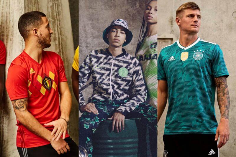
The 2018 World Cup is fast approaching, and this time it’s wall-to-wall retro.
This year’s jerseys have all got futuristic names like Breathe, and VaporKnit, and show off custom colours with titles marred by cliches such as Tribe Blue, Mystery Ink and Noble Indigo. England is even sporting ‘Blackened Blue’ as their away colour, presumably Pantone-matched to the bruises on Dele Alli’s knees after diving in the box all season.
It’s serious because it’s so commercial. In the run-up to the last World Cup in 2014, Creative Review boldly wrote “the desire to make better kit goes hand-in-hand with the need to drive sales”. With retail targets and football’s commercial side bigger than ever, Adidas senior design director Juergen Rank has also said that kits have to meet both the “needs in a stadium and on the street.”
As a result, this year’s unveiling photos show football tangled in casual culture; from sofa-jumping Croatian fans to rapper Niska standing alongside international stars for Les Bleus. Jerseys are shot over hoodies and coupled with gold chains, captured on street corners and in underpasses. So in what’s likely to be the most stylish tournament yet, and with high-street fashion revisiting the fantasy of vintage street style, it seems this Cup’s sportswear is following suit.
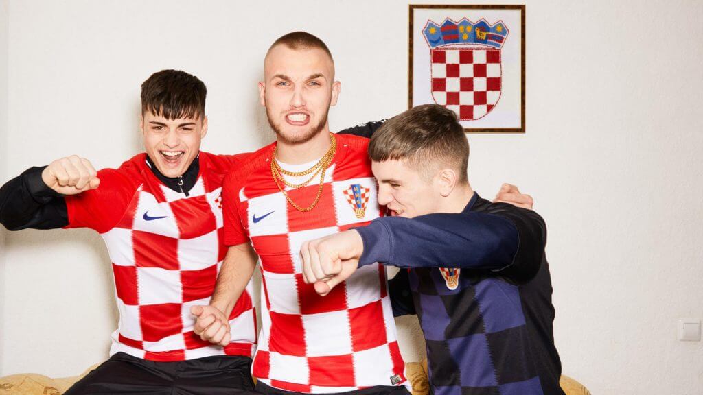
Heading back to the 80s and 90s, block colour strips are a little out of favour as the ostentatiousness of geometric shapes, tessellations and chevrons are firmly back in.
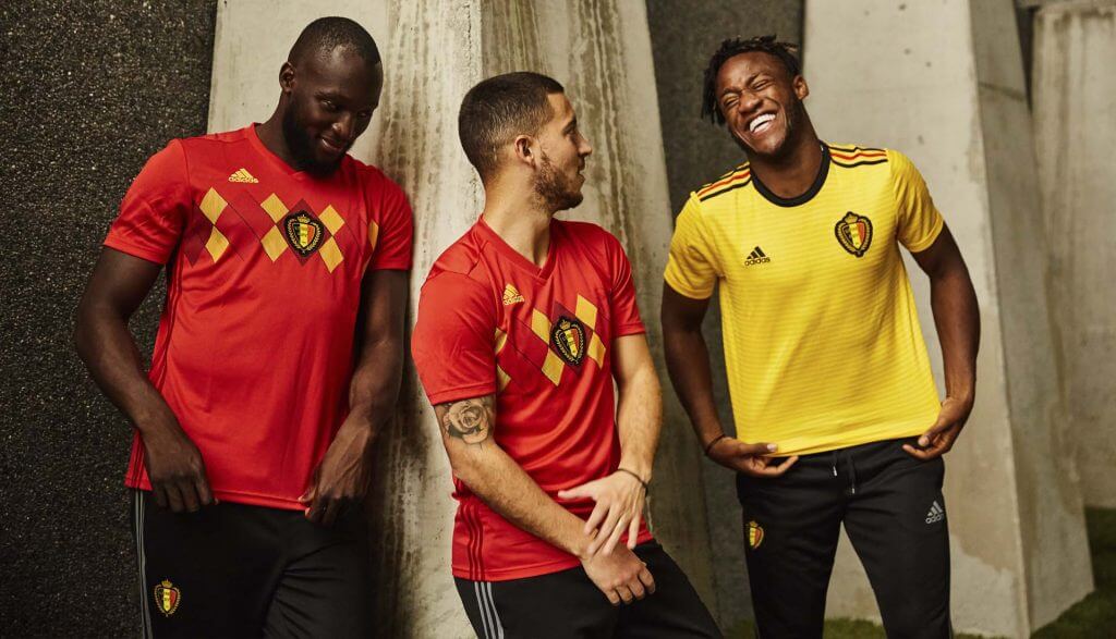
Germany and Mexico are throwing back to 1990, Spain wants you to remember 1994, and host nation Russia is giving a nod to that time they snatched Olympic Gold in 1988. If it was possible to get a palette brighter than their samba gold, Brazil is going more vibrant by colour-matching to their winning 1970 kit. Belgium’s home jerseys even have an echo of ‘classic knitted golf jumper’ about them.
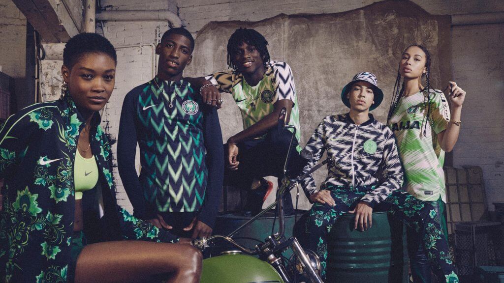
Excitingly, Nike decided to shake it up this year for Nigeria and focus on their local music and fashion. Inspired by their ‘94 kit, the home strip is covered in white feathered chevrons in an ode to its culture. The country’s kit generated a buzz on social media and fans worldwide suggested the team should win the Cup on the sheer brilliance of the shirt alone. It doesn’t stop there either, with the same zeal being applied to their floral travel suits and bucket hats. If indeed sportswear needs to work in both the stadium and on the street, Nigeria has succeeded. Their unveiling shots wouldn’t look a pixel out of place in street style lookbooks and indie blogs.
Germany’s away kit has garnered a great deal of interest too, more so than it’s traditional home version. They plan to wear an Italia 90-inspired green kit that also works both on the pitch and alongside jeans in the street. It’s gorgeous, even if it does give a nod to when they painfully handed us an old-school ‘Brexit’ in the semi-final that year.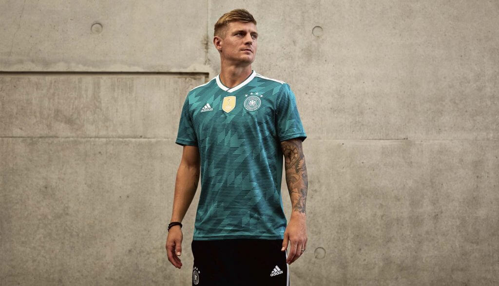
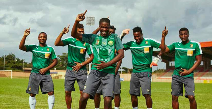
And lastly, Cameroon (who awkwardly failed to qualify) also revealed a shirt fighting for worldwide attention. A geometric lion graphic emblazons the front in an attempt to reflect the pride and passion of the fans and nation.
 Who didn’t get the memo?
England, obviously.
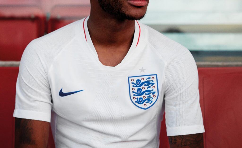
Predictably, Nike’s England kit clings on to the simplicity of its ‘66 strip. It’s mature and classic. However, neither the team nor their kit is trophy-winning, nor is the thought of paying £100+ for a plain white jersey with a tick on the front. If anything its minimal and polite approach means it’s befitting (and that’s not a figure-hugging joke) that an Englishman wears it.
But the retro look is so sought after by fans, in fact, that many England supporters are divided. The more colourful training top is more synonymous with the trend for vintage, and many fans resorted to Twitter to request it be used as the home shirt instead. It’s jazzier enough for me to admit that I’ve pre-ordered one, and nostalgia is evidently back in since it was inspired by the Admiral 1982 kit. Even if it stays behind the scenes, it can at least pride itself on being the only recent example of us not going to a World Cup with a bag of Primark basics.
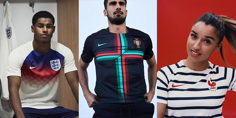
Unfortunately, the pre-match jerseys might just be the best example of kit design this year. Whereas most Nike home shirts are understated and plain, the warm-up tops are surprisingly bodacious. Portugal’s shirt shouldn’t work, yet does, and France’s striped option is so French it perfectly balances stylish naval garb and a Joules’ spring collection.
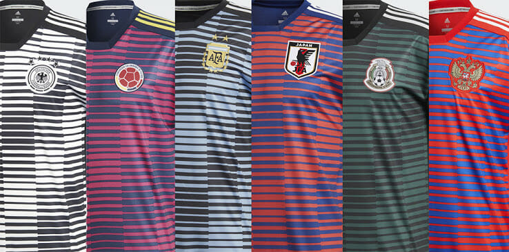
Adidas’ pre-match uniforms can’t be ignored either, even if they do all look the same. Made from recycled polyester, that’s not the only thing reused as the jersey designers reskin the same template for all the teams they’re representing. They’re undeniably good, though.
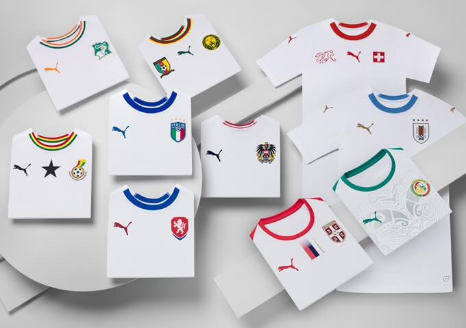
Sadly, Puma must’ve been exhausted from all their creativity, as there seems to be a common theme in their change kits. Just like Adidas with their pre-match top, Puma has offered themselves up to be this year’s example of the disappointing trend for manufacturers to base designs around one or two simple templates. Although not as upsetting as Adidas’ identical shirts for Armenia, Faroe Islands, Luxembourg and San Marino during the qualification stages, in the last few days Puma have rolled out very similar all-white designs for nearly 10 different countries. How they claim to represent all the countries’ cultures with a reskinned white top is yet to be figured out.
So, with the World Cup being a World Catwalk for kit fanatics, both teams and fans are hoping they can replicate previous successes with recreations of classic shirts. All we know for sure is that whilst we’re so ready for retro shirts to take centre stage, thankfully
Why not email hello@little.agency or call 0113 828 0000 to find out how we can help you to transform your content marketing.


Still the same great data driven services, but now with a different name