19 March 2021
Using TikTok for business: What you need to know
Read More

Ah, dark mode. Email’s latest enigmatic interface of the moment.
As marketers, we’re no stranger to customising the user experience, and tailoring emails to best suit subscriber preferences. This is probably why dark mode (and its impact on email) is causing us some headaches. After all, there’s nothing worse than finding out an email client does something less-than-ideal to your latest campaign because of dark mode, which could impact clicks and conversions.
If you’re currently scratching your head as a result of dark mode and its impact on your email campaigns – I can guarantee you’re asking yourself questions like:
If so, I totally sympathise. Thankfully, we’re going to have a bit of a crash-course in dark mode, and how you can keep smashing your campaigns to secure the best results.
You’ve got this:
So, where did dark mode come from?
The reality is, for the very first computers, dark mode was the default, because of the capacities of the cathode-ray tubes (CRTs) used back then. That’s why the computers of the 70s and 80s featured some heavy matrix-style interfaces, with dark screens and green text.
After CRTs came electroluminescent (ELD) screens – the kind you’re probably most used to seeing in your car. Colour LCDs followed ELDs in 1983. Once colour LCDs became mainstream, light mode also became standard (not only for computers, but all the tech that followed). After all, LCD screens were backlit; it would have used more power to turn the screen black or grey.
And, of course, computers then became the staple of the modern workplace. And, people who weren’t programmers were introduced to them for word-processing capabilities. So, the interface had to be tweaked to resemble something people would be more familiar with: white paper. Once this skeuomorphic approach was implemented, dark mode was definitely pushed back into the shadows.
It wasn’t until the mid-2000s when LCDs finally overtook CRTs in image quality to become the standard in laptop and desktop displays. In time, LCDs became LEDs (which had a more precise backlight).
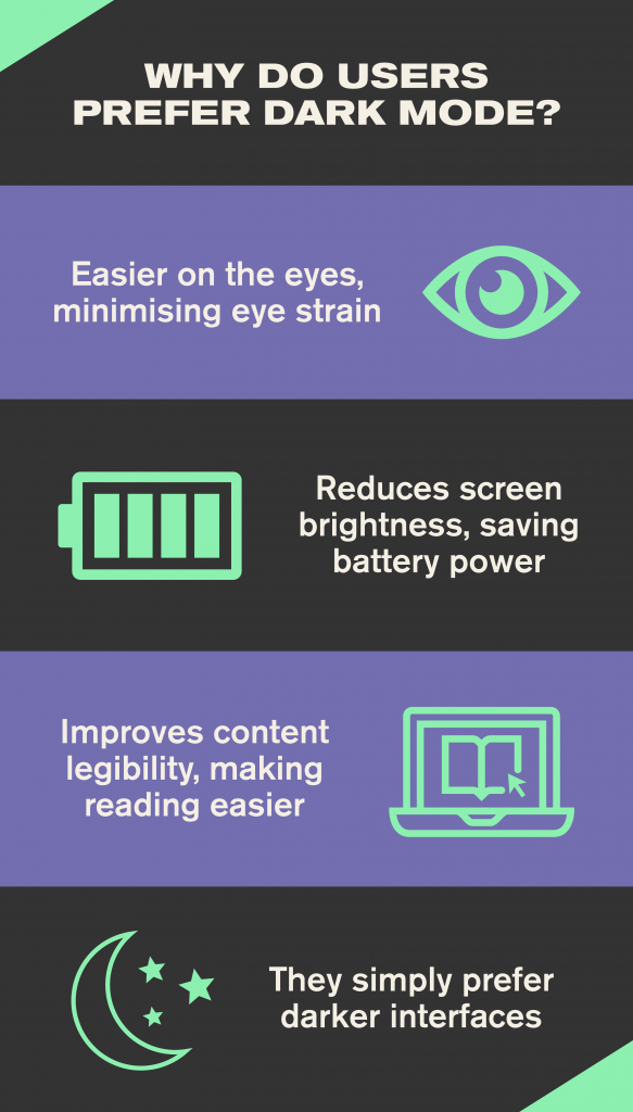
Now, we have OLED screens, which don’t require a backlight. OLED screens are the only displays that preserve battery life in dark mode. The more you know.
In 2016, Twitter introduced a dark mode (and its users complained it wasn’t dark enough). The reintroduction of dark mode provided many users with a welcome breath of fresh air. Once again, they could customise their digital environment to best suit their own personal preferences.
There, you’re all caught up.
Using dark mode is very much down to personal preference. It isn’t a cure for all ills. While some may report feeling more comfortable and less tired while using dark mode, others will become more easily distracted (since the colours will ‘pop’ more).
That being said, science shows that the human eye is more used to positive polarity (light on dark). Our eyes work like a camera lens. When we see something in positive polarity, we see things sharper and in more detail. On the other hand, when we see something in negative polarity (dark-on-light), less light is coming to the eye, making things seem blurrier.
Have you ever noticed that white text on a black background will have a halo? You’re not the only one – it’s because the light emitted by the letter is reflected by the other letters.
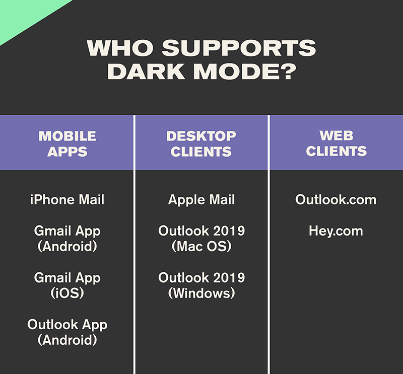
Everything I’ve talked about so far has played a part in the prevalence of dark mode in email marketing in 2021. Since Apple introduced dark mode to its desktop client in 2018, other clients soon followed suit.
Currently, these clients and apps offer a dark mode – either as a setting a user can set manually, or by detecting the user’s preferred colour scheme:
Now, you may be thinking, “well, that all seems quite straightforward”. Let’s set the record straight: some email clients will automatically force their default dark mode onto your styles if you don’t intervene.
Just because these clients offer a way to set their UI to suit dark mode, doesn’t mean clients will handle your emails in the same way.
Primarily, there are four ways a client could potentially deal with your emails (spoiler: here’s where it gets a bit complicated):
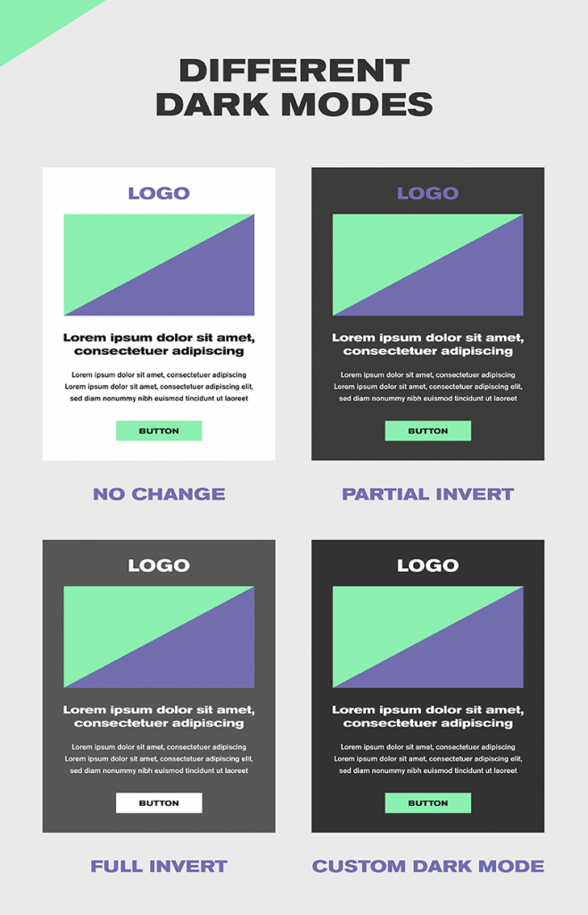
No change
While some clients will let you change their UI to dark mode, it won’t impact how an HTML email is rendered. In some ways, this is a positive – regardless of whether the app is set to light or dark mode, the email will always look exactly the same.
Default dark modes
A few email clients will automatically force their default dark mode onto your email without your intervention. The typical default dark modes are either partial colour invert, or full-colour invert:
If you’ve ever received an email while your phone is in dark mode, and it looked awful, you’re not alone. So, if you want to remove the risk of a default dark mode, the solution is to apply your own dark mode styles.
To do this, there are two methods you can use:
Works in very much the same way as applying a block of styles inside a @media query for Mobile Responsive view, except this CSS block targets any user interface that’s set to Dark Mode.
The [data-ogsc] tag specifically targets the Outlook app. Duplicate the @media (prefers-colour-scheme: dark) styles that are already applied and add the appropriate [data-ogsc] prefixes to each CSS rule.
Here’s how email client support for dark mode is currently looking:
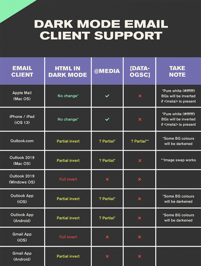
Unfortunately, there’s no consistent support for targeting dark mode users across email clients. Thankfully, most clients can be targeted via either @media (prefers-color-scheme: dark) or [data-ogsc]. Phew!
With the average person spending six hours and twenty-five minutes (August 2020) on their phone every day (and that’s not even taking into consideration the rest of the time spent in front of a screen), surely switching to dark mode has the potential to have a huge – and positive – impact on our tech usage and general health?
Ultimately, all you can do is make your email marketing campaigns as engaging as possible and best suited to your audience’s needs. Creating a custom dark mode is a great way to achieve this – all your bases will be covered.
In the meantime, just keep everything crossed that Gmail comes to its senses, and allows you to override their own dark modes very soon.
Why not email hello@little.agency or call 0113 828 0000 to find out how we can help you to transform your content marketing.
Still the same great data driven services, but now with a different name


