26 September 2019
More than mixology - why marketing is the secret to bar success
Read More

There are an estimated one billion cars driving around the streets and motorways of the world, which probably makes car logos one of the most ubiquitous design elements around today.
Many are steeped in the rich history of the company’s engineering or racing heritage, and from the early versions of our four-wheeled companions right up to the boundary-pushing electric cars of today, the logos have sat proudly on the grills and bonnets throughout the years.
There has always been great variety in the style and layout of car logos, from early complex crests to more simple design marques. In the early 2000s, there was a trend across the car industry to take direct inspiration from the badges from the cars themselves and make the logos have a 3D metallic look, using silver gradients all over the place. Which echoed the general design trends of skeuomorphic style elements made famous by Apple’s iOS system.
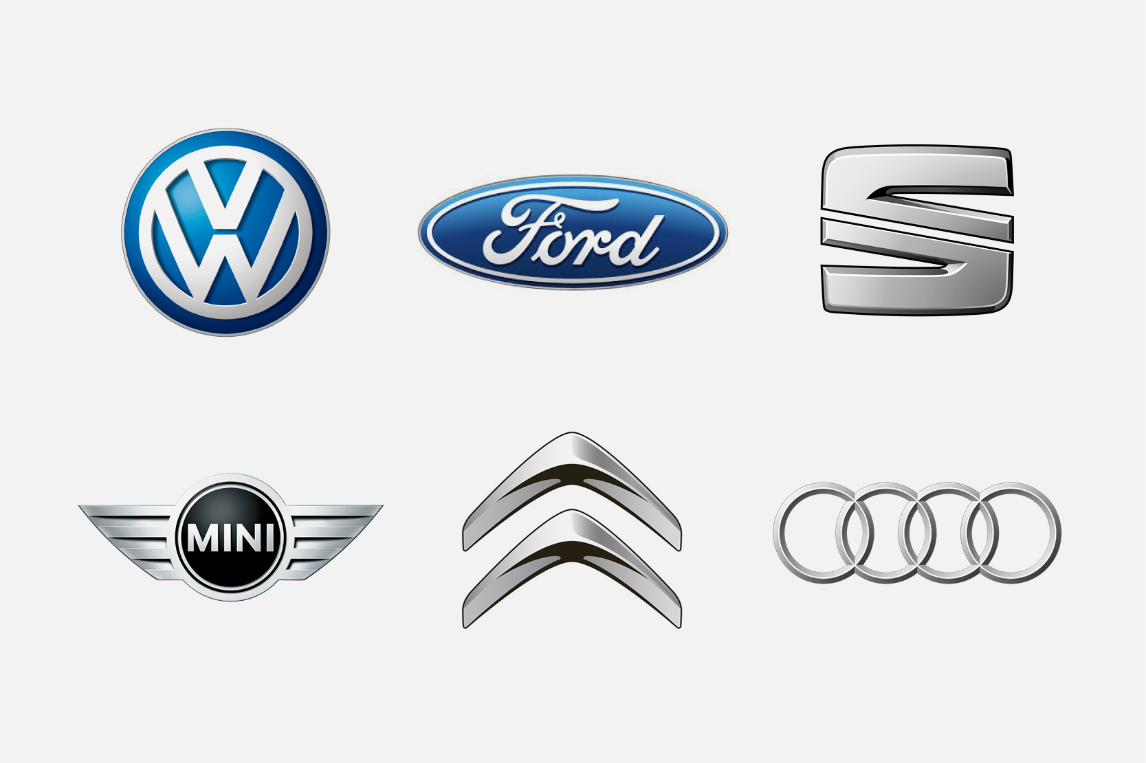
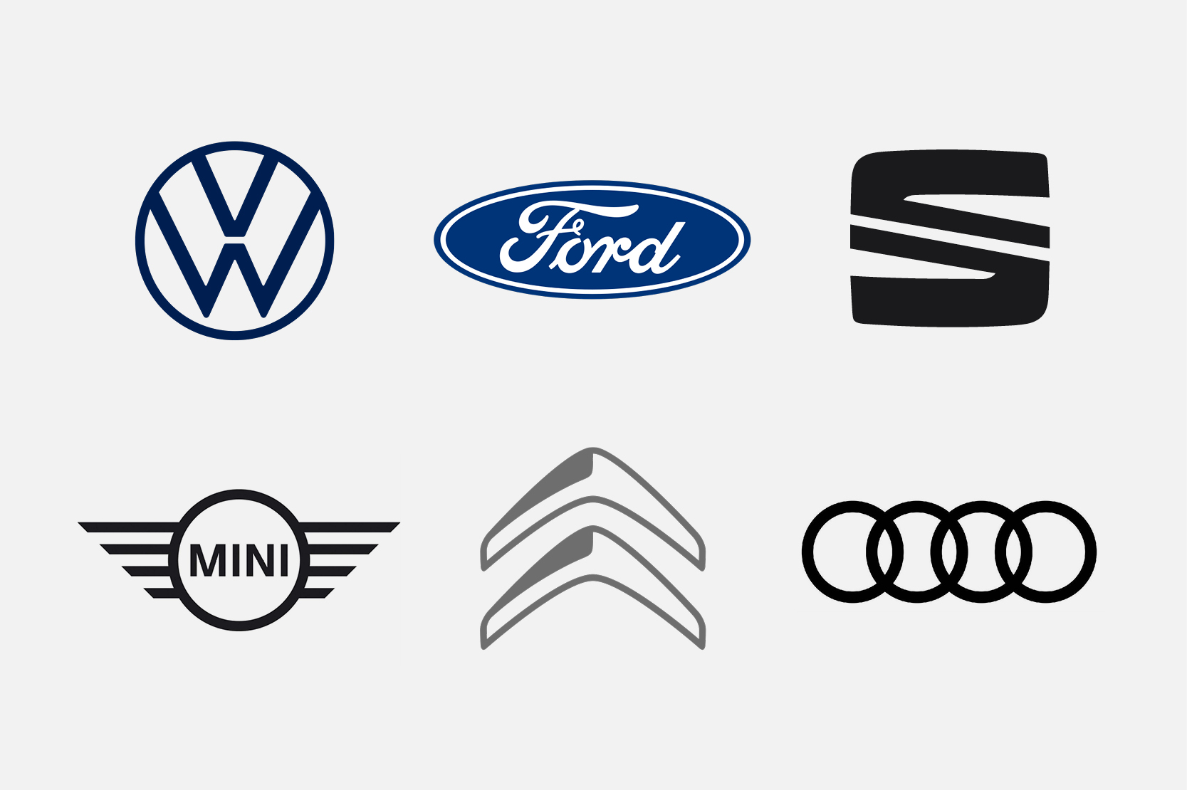
Recently, I’ve noticed a switch back to flat style logos from a few of the larger car brands, as they reposition their brands to be more relevant to their audiences today. The few I’ve noticed are VW, Ford, SEAT, Mini, Citroen and Audi. They have all opted to create flatter versions of their most recent logo incarnations, and I am a fan! They are a lot cleaner and allow for a more developed brand to be used around the logo.
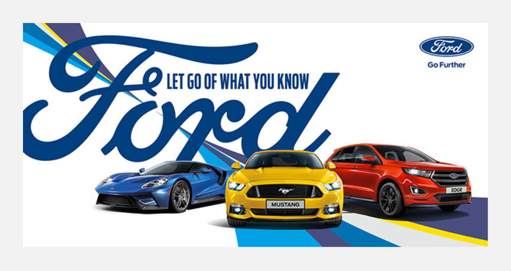
A good example of this is Ford, the logo change was more subtle and part of the wider brand refresh. I first noticed their TV and print advertising started to use the script of the logo very large in the background and layered behind the cars themselves. It really stood out from the generic car promo shot, with its striking presence.
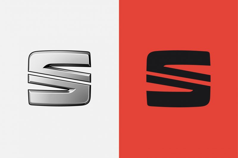
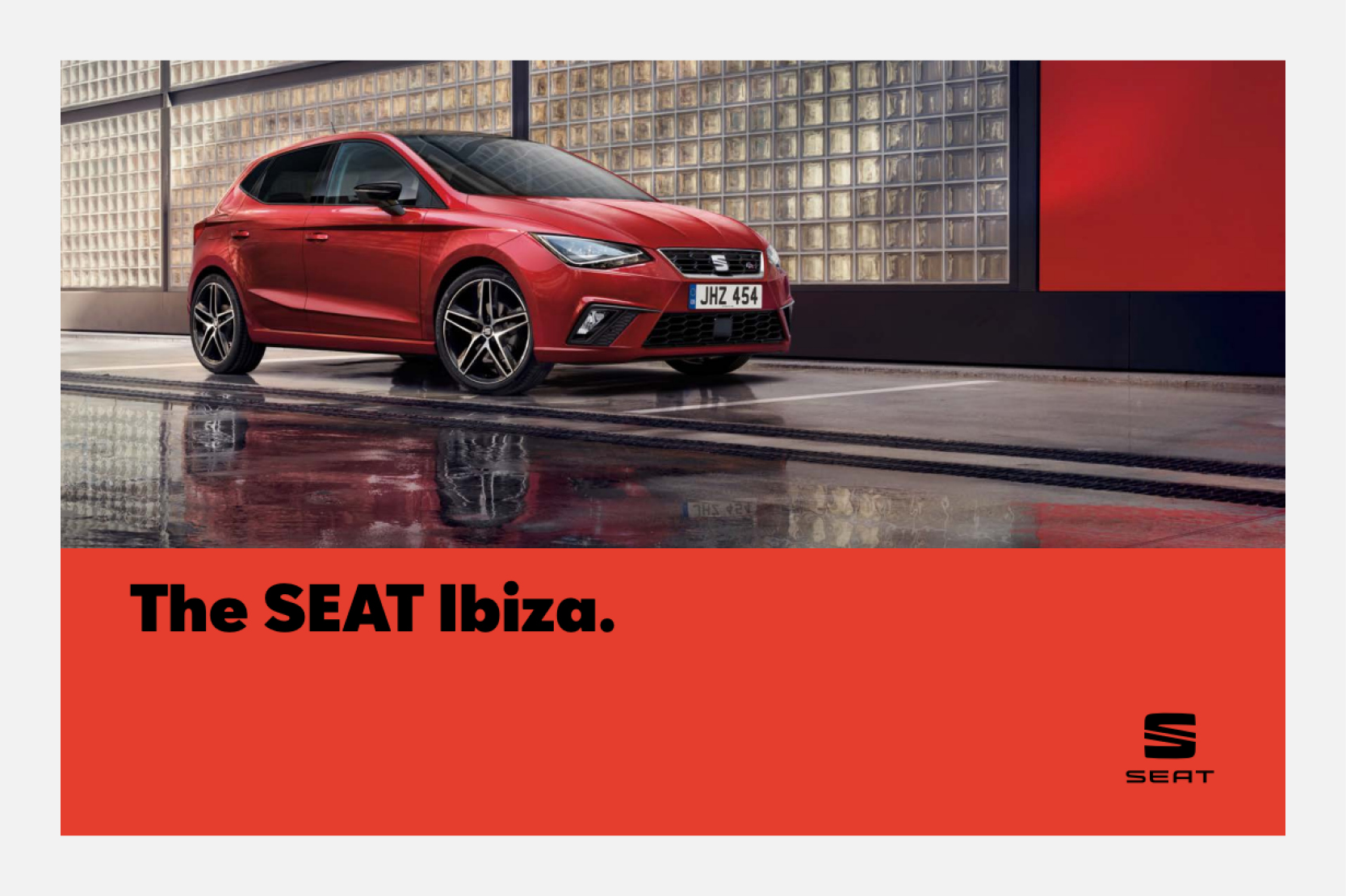
SEAT have also done this very well. The SEAT brand has always been targeted to a younger audience, being the more ‘sporty’ of the VAG group. In the past year or so they have flattened the logo and brought in a bold but friendly sans serif, strong colour palette and a simplified layout structure on TV and print collateral. All this along with the simplified logo makes them feel like a very modern and fresh car brand.
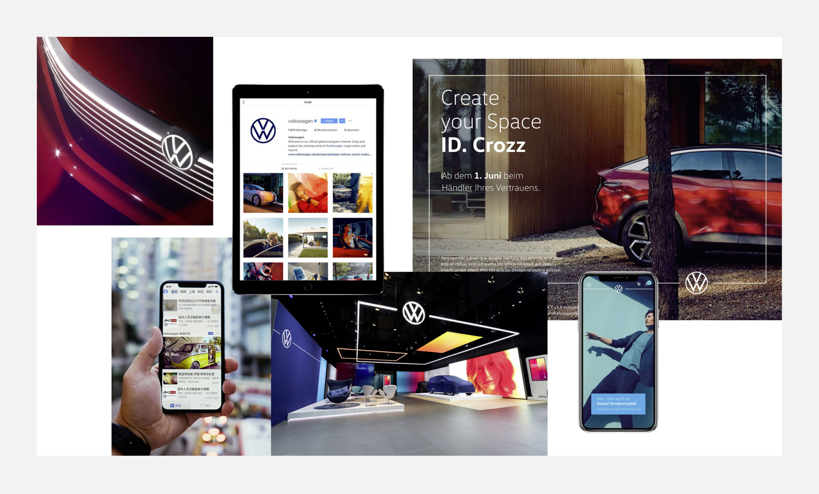
The most recent car brand to take the plunge into a brand refresh is the somewhat apologetic VW. Having gained bad press for the emissions scandal, they have set out their vision for their electric future with the unveiling of a slick new logo and brand. The logo has been slimmed down and the whole brand has been electrified with a clear nod to their e-future. I think it’s a natural progression for a company that is known for its slick and well-engineered cars. The new logo is accompanied by a range of vehicles grouped under the ID. brand, which follows suit with the simple aesthetic.
I feel like this trend (or natural progression) of flattening car company logos has been slow in it’s build up, which is a good thing, because it might mean companies are considering whether they need to do it, and not just doing it to jump on the bandwagon. Some more high end brands like Aston Martin, Bentley and Rolls Royce rely on their heritage and prestige to appeal to customers, so perhaps they won’t change.
However, I predict the more accessible car brands will make the change in the coming years as the electric future becomes fully switched on.
Why not email hello@little.agency or call 0113 828 0000 to find out how we can help you to transform your content marketing.
Still the same great data driven services, but now with a different name


