7 May 2018
World Cup 2018: Fans are looking forward… to looking back
Read More
It’s been a very busy start to the year, seriously…. I don’t think we have ever witnessed so much great work coming out of the industry in such a short space of time. Rebranding is one that consistently comes up each week, with household names matching the likes of Google with straight, simple sans serif fonts (cough HSBC cough) and others completely changing the face of their brand. We have selected a handful that we think work particularly well and one that confused us all. We have also thrown in a marketing campaign towards the end that recently caught our eye and the attention of the entire industry.
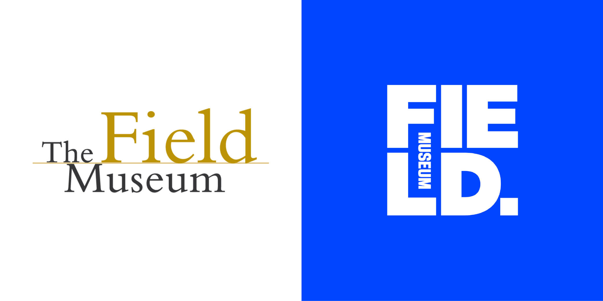
At the start of March and after almost two decades we were graced with a rebrand for Chicago’s Field Museum. Bringing a more in your face and bold identity to the table, the museum has completely changed its marketing direction and style to bring attention to the institutions bold commitment to furthering scientific understanding. Using bold typography and a powerful blue duotone, the institution now stands out as of the best museum rebrands I’ve ever seen.
One of the more subtle rebrands comes from Pentagram with the evolution of American Express’s recognisable ‘blue box’. Ditching the gradients for flat colours and introducing a responsive logo for use on social media platforms, Amex appears to have gone for a more performance-based change than one to merely update an old identity. Plus, with such a wide roll out across all media channels and products, the bold blue and simplified type from type designer Jeremy Mickel work so well together, providing an unmistakable identity seen across the globe.

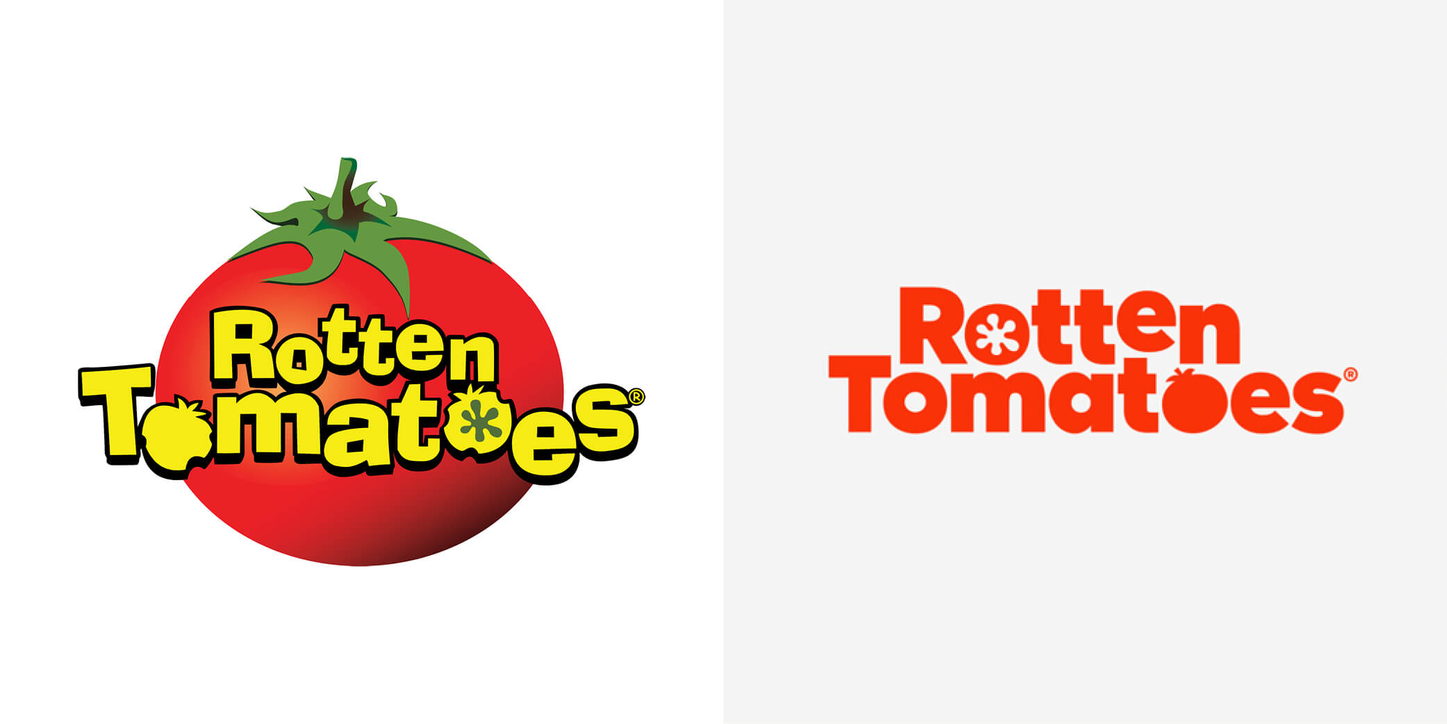
Pentagram strikes again, this time it was the turn of online film review giant Rotten Tomatoes. I personally have always found the RT logo to be bad… especially as it was portraying a site with such strong and highly regarded film reviews. Emily Oberman and her team tightened up the old 2001 logo with a new typeface, finally ditching that dated ‘clip art’ style tomato. With more of a selected colour palette and a clever use of negative space, this was one rebrand I have been waiting for since I was old enough to use the internet…
It’s always nice when something quintessentially British gets a bit of a makeover, especially when there is print involved. After a devastating financial year across the newspaper industry (£45m losses) The Guardian decided to change its visual offering with an updated identity and print process. Bringing in a new custom typeface and a reduced print sized paper ditching the costly Berliner presses for the Trinity Mirrors presses, the brand hopes to appeal to its readers new and old whilst cutting costs along the way. The typeface looks great, it’s well thought out and constructed, plus it looks perfect when used online and as a digital icon.

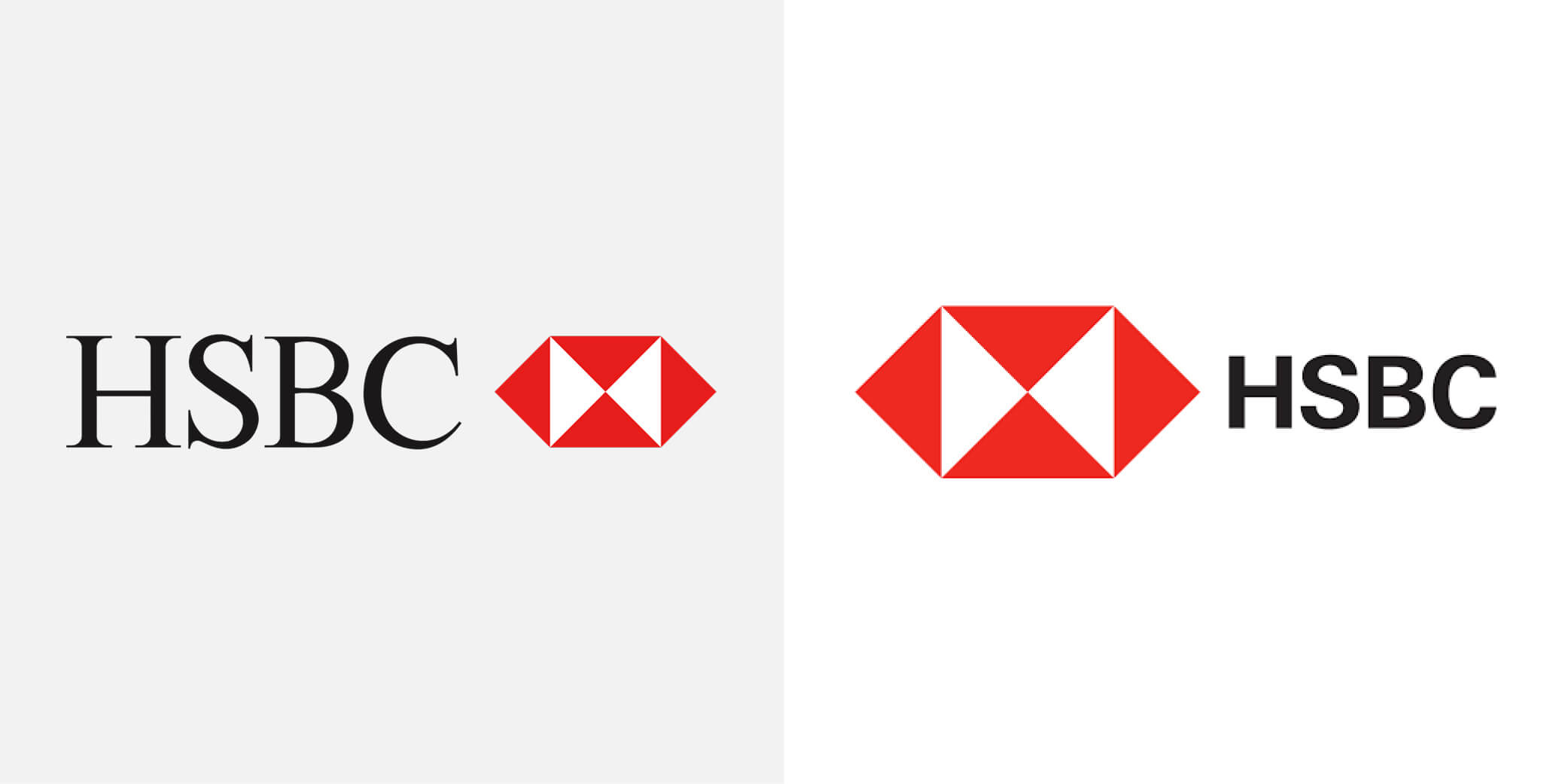
HSBC is another banking giant we have seen evolve its brand over the past year, this time with more of a subtle change compared to that of MasterCard’s the year previous. The serif font is gone… it’s a change we are seeing time and time again, brands are ditching the dated typefaces to simple, bold sans serifs. Google started it and since we have seen the likes of eBay, Santander, Gap and Lufthansa follow suit in simplifying their typography. I think it’s a very subtle change, most of the banks’ users won’t notice, but it makes sense to follow the herd when it comes to appearing that little bit more modern, especially in today’s banking industry.
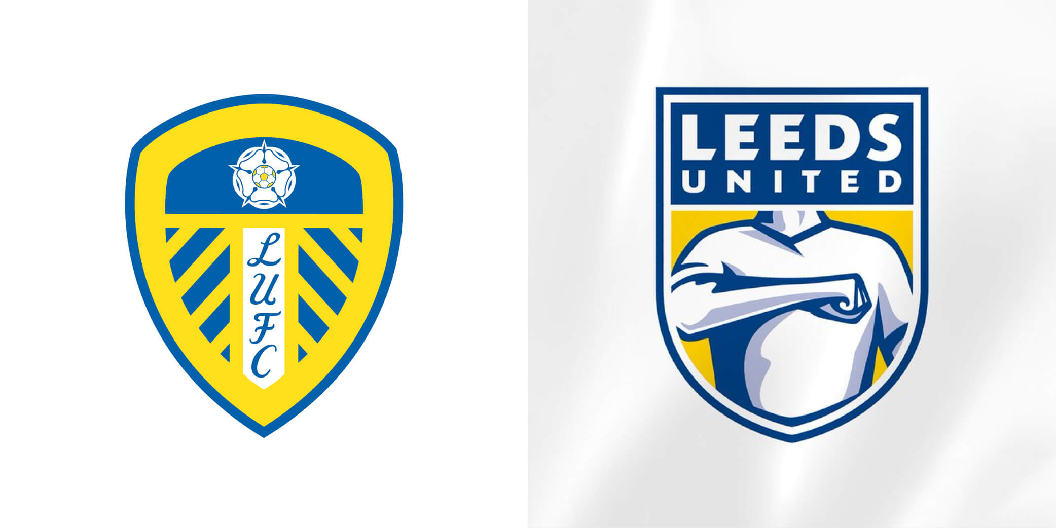
Now…if you missed this travesty prepare yourself, it’s the Leeds United crest redesign. A prank gone wrong? A genuine attempt at a rebrand? Or a very clever PR stunt… you decide. The club released a new crest after six months of research and consultation with over 10,000 people, it’s safe to say it did not go down well… with anyone. Petitions, outcry and backlash followed the club for the next few weeks and we still don’t know what they were thinking, especially as the ‘crest’ was shortly available to download as a stock vector from Shutterstock. We just hope they didn’t pay a designer or agency thousands for it, but we will have to wait until 2019/20 for the updated badge after a delayed launch was announced in March.
 Battersea
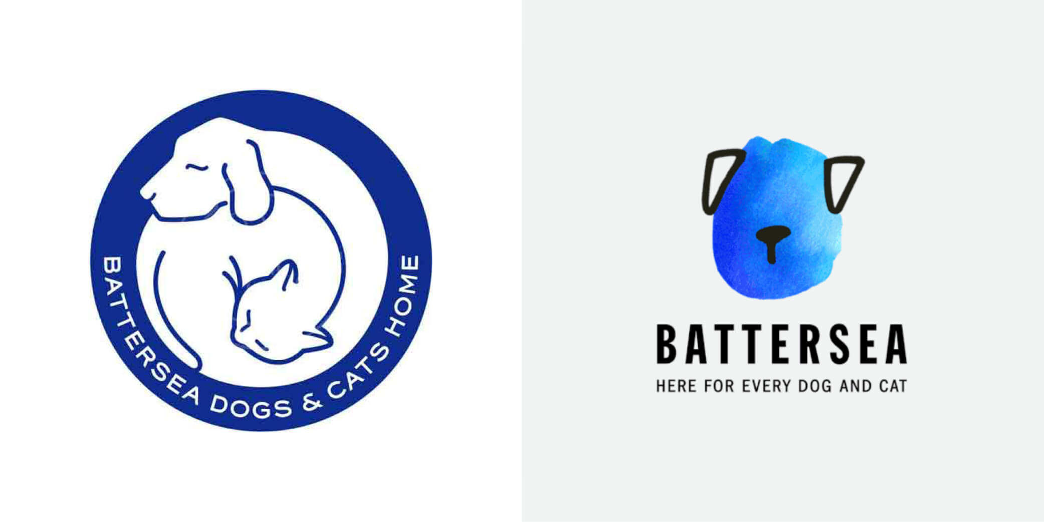
We haven’t seen many charities update their identities recently, which was why it was kind of refreshing to see Battersea’s ident completely change and bring in new elements that work so well as the heart of the brand. With a family of watercolour shapes illustrated as different animal characters, it’s another great example of a responsive brand that steps out of the ‘consistency is key’ frame of mind. For those who don’t know what a ‘Responsive Brand’ is I can almost guarantee you’ve come across one in the past. They are basically brands constructed from a library of possible elements, combinations and colours, all mixed together in a number of combinations. A few great examples of this are NOW TV, Oi and Craft, all of which use multiple combinations to give their brand a sense of being ‘One of a Kind’. Whilst these present designers with so many options and variations in which to present a brand, it’s nice to see charities taking on responsive brands, it’s a great way to really stand out from the crowd and build an identity that can continue to grow & develop as the brand itself does. There is a great purpose behind that range of different shaped animals showing the charity will unconditionally care for any animal that comes through its doors. Along with a full rollout across all digital, print and shop items, the brand has dropped the phrase ‘Cats & Dogs Home’ to reinforce the fact that they are not a permanent home of these animals but that they are trying to find new, lifelong homes for them.
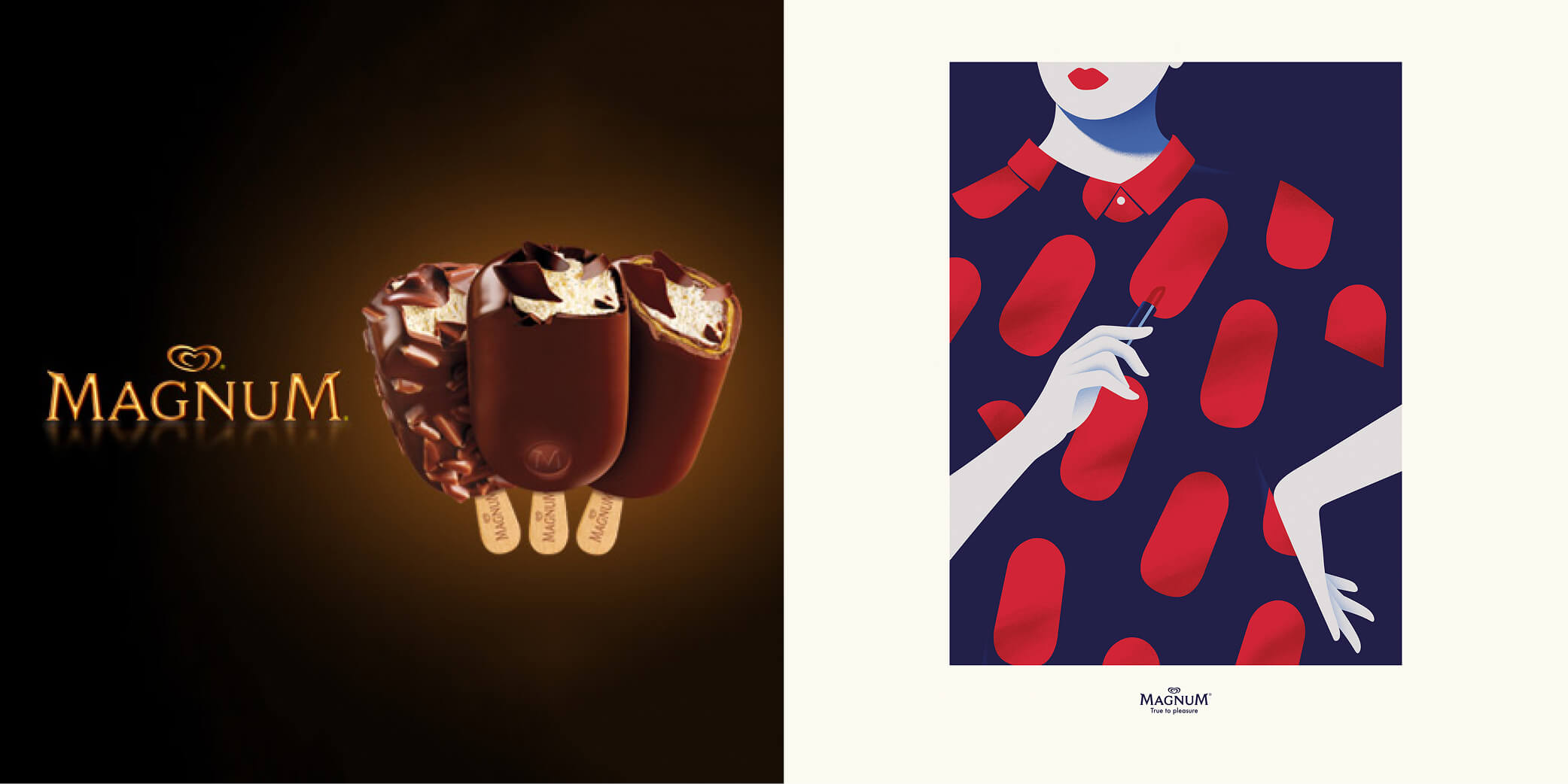
Our final rebrand is the marketing campaign of Magnum, who switched from their classic photography lead campaigns to a completely illustrative one. Working with the Spain based agency LOLA MullenLowe they commissioned the illustrative skills of Thomas Danthony, to produce a range of images for their new ‘Pleasure’ advertising campaign. Using a simplistic colour scheme, the iconic Magnum ice cream silhouette is featured throughout, hidden within the smooth scenes. It’s nice to see Magnum heading down more of a fashion and stylised illustration route, perhaps trying to attract a larger market of ice cream consumers. It’s a wonderful campaign but I can’t help but think Malika Favre’s influence is plastered all over the artwork. Of course, there are always illustrators with similar styles out there in the market, but I think the industry changing work Malika has produced over the last few years has had a large influence on this female-led campaign. None the less we loved it, it’s effective, super simple and carries the brand strongly into new marketing terrain and hopefully more artwork like this.
Why not email hello@little.agency or call 0113 828 0000 to find out how we can help you to transform your content marketing.


Still the same great data driven services, but now with a different name