11 September 2018
Is AI going to take over the world and enslave us all?
Read More
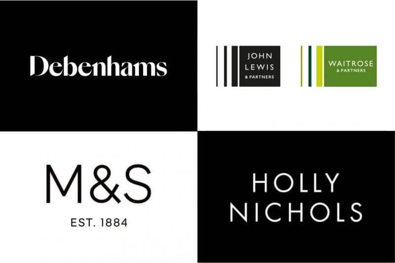
It appears nowadays, department store rebrands are like buses. You wait for ages for one, 20 years in Debenham’s case, and then along come two in the same week. Amid all the talk of a high-street crisis, I wanted to put all that aside for a second and analyse the visual aesthetics of the rebrands and whether they are effective in achieving their objectives.
Recently, high street mainstay Debenhams revealed a new logo and visual identity courtesy of Mother Design with the aim of bringing the 200-year-old store’s look up to date and to appeal to a younger crop of shoppers, bringing back the joy of shopping.
The new logo is derived from the typeface SangBleu creating a very striking and balanced wordmark. The stark contrasts between thick and thin within the letterforms creates a more sophisticated aesthetic and moves away from the all too common spaced out sans serif type style that is seen nowadays. It harks back to a more traditional type style used within signwriting and shop fronts from the 18th and 19th centuries, while still being relevant and modern.
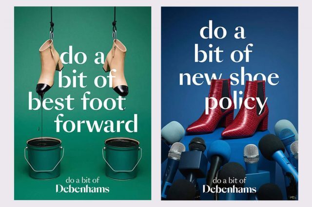
To accompany their new logo, Debenhams has unveiled a new campaign that encourages shoppers to ‘do a bit’ of whatever aspect of shopping makes them happy, with the tagline ‘do a bit of Debenhams’ tying the campaign together. The tagline flows well off the tongue but feels to me a bit cheap for where Debenhams have positioned themselves in the market as a mid to high market retailer.
They seem to have jumped on a marketing technique that we see a lot, of having a phrase that can be applied to various items or personas. An example of this being Pandora’s ‘Do’ campaign that set out to appeal to a wider audience by applying their jewellery ranges to different moments in time.
Within the same week as Debenhams, Waitrose & John Lewis announced a new brand that brought together the two companies using the suffix ‘& Partners’, bringing the employees to the forefront of their brand.
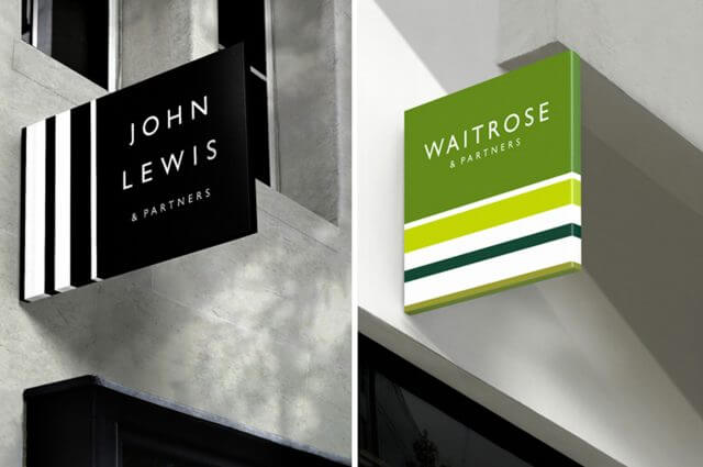
Created by Pentagram partner Harry Pearce, the new logos appear in the classic typeface Gill Sans within block colours accompanied by stripes of varying thickness. The lines are said to be inspired by a pattern that was made by Peter Hatch for the John Lewis Partnership in the 1960s and the company’s haberdashery past.
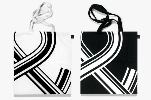
You can certainly see the ‘retro’ inspiration, but I am not convinced by the final outcome. On first view it immediately felt out of date for me and doesn’t scream ‘pushing the company forward’, but perhaps this traditional feel is where they want to position themselves.
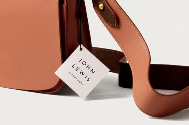
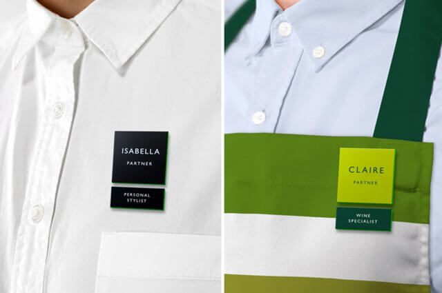
In terms of the wider brand elements, when I saw them I was a little more convinced about the new identity. The line pattern is used creatively across various collateral including bags, aprons and signage, and the small brand intro video gives the design more context on where the lines were drawn from. However, I feel like the wider brand elements are sugar-coating it and making the main logos look better than they actually are.
Somewhat old news, but still interesting to look at in this context is the brand refresh of Marks and Spencer in 2017. Although younger than Debenhams at a relatively spritely 126 years old, M&S is just as well established on the high street and have evolved their brand gradually over the years.
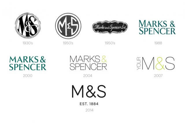
The most recent iteration saw the company adopt the ubiquitous bold, spaced out, sans-serif typestyle for the logo, and pair back the design style for other branded items. Making use of that classically overlooked design element; white space, and adopting a black and white colour palette for the brand allowed for the photography of the food to really make an impact. Reinforcing what they are known for; not just food, M&S food.
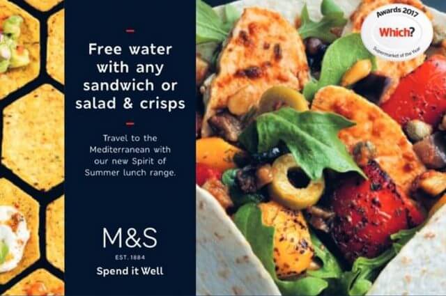
The paired back design did make for a more premium feel to their aesthetic if possibly going too far and making the brand a bit boring and too simple.
Something else worth mentioning is the trend of high street retailers temporarily changing their names in celebration of cultural events. Examples of this are Marks and Spencer changing to ‘Markle and Sparkle’ in aid of the royal wedding earlier this year, and more recently ‘Harvey Nichols’ have changed their name for a month to ‘Holly Nichols’ to support female empowerment, accompanied by events throughout the month.
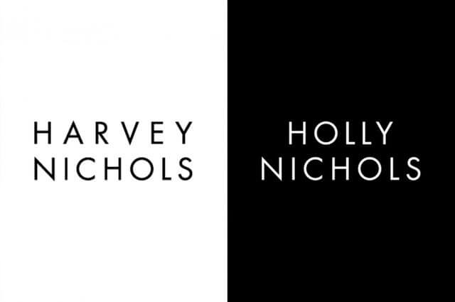
All these takeovers take are simple logo changes and I feel they work really well in re-engaging audiences and staying relevant to the social media age. They also show the recognisability that these brands have secured for themselves and the confidence they have in their customer base.
Overall there has been a shift towards cleaner and bolder looks in the high street and department store branding, paring back the design elements to let the products shine through. It could be said that they are using the new looks to put their past behind them and look forward to a more modern high street retail landscape.
However, of course, there is a much larger discussion to be had about the state of the high street, and whether the rebrands mentioned are meaningful steps to a improve the value of your local shopping precinct or just desperate attempts to modernise and stay relevant.
Whatever the future may hold for our high streets at least now they look a little more refreshed and pleasing on the eye for us design kids out there.
Why not email hello@little.agency or call 0113 828 0000 to find out how we can help you to transform your content marketing.


Still the same great data driven services, but now with a different name