10 June 2022
Talking shop: Getting to grips with graphic design at Leeds City College
Read More

 Insight Create Perform
There’s a lot of talk about accessible design, but have you ever thought about colour accessibility?
Colour accessibility is a tool that enables people with visual impairments or colour vision deficiencies to interact with digital products in the same way as their non-visually-impaired counterparts.
In 2017, The World Health Organisation estimated that roughly 217 million people live with some form of moderate to severe vision impairment. This statistic alone is a reason enough to design with accessibility in mind.
Aside from accessibility being an ethical approach to design, there are potential legal implications for not complying with regulatory requirements around accessibility. In 2017 in the US, 814 lawsuits were filed against websites that allegedly did not meet accessibility standards.
In short, a product that isn’t designed to be accessible isn’t kind, so be kind.
Catching those accessibility requirements early in a product’s life cycle is key – it will reduce the considerable time and money you’ll have to spend going back and redesigning your products after they’re live on the web. Colour accessibility demands a little attention up-front when selecting your product’s colour palette, but ensuring your colours are accessible will pay dividends later down the road.
Here are some quick tips to ensure you’re creating colour-accessible products:
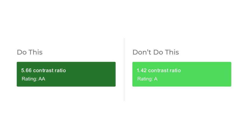
To meet W3C’s minimum AA rating, your background-to-text contrast ratio should be hitting at least 4.5:1. So, when designing things like buttons, cards, or navigation elements, be sure to check the contrast ratio of your colour combinations.
There’s a wide variety of tools on the market to help you test the accessibility of your colour combinations, most notably would be Stark. Stark allows you to inspect contrast levels in real-time via a contrast checker. Also, Stark will notify you of any AA or AAA-rated colour alternatives with smart colour suggestions.
It’s also baked right into Figma, Sketch, Adobe XD and Google Chrome, very handy!
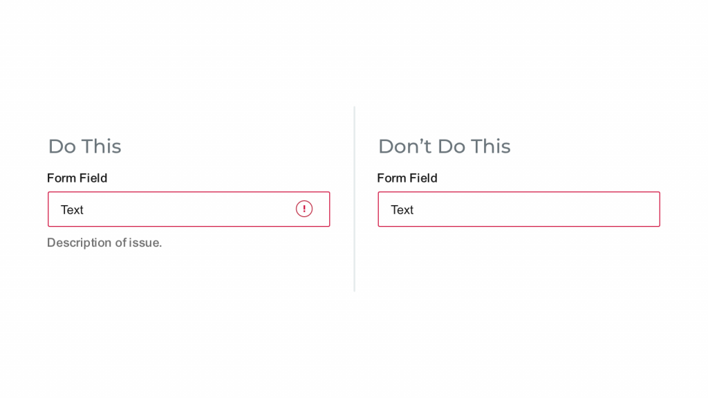
You can also ensure accessibility by not relying on colour when relaying crucial system information. When looking at things such as error states, success states, or system warnings, be sure to use correct messaging or iconography that clearly calls out what’s going on.
Also, when displaying things like graphs or charts, allowing users to add texture or patterns ensures that those with colour vision deficiencies can distinguish between them without having to worry about colour affecting their perception of data. A great example of this would be Trello and the Colorblind-Friendly Mode.
New colorblind friendly labels for monochromatic vision. Enable colorblind friendly mode in your account settings. pic.twitter.com/1w95Ok9GKw
— Trello (@trello) December 12, 2014
Focus states help people navigate a site with a keyboard by giving visual indicators around certain elements. They’re helpful for users with visual impairments, motor disabilities, or just people who like to navigate with a keyboard!
All browsers will have a default focus state colour, but if you plan on editing that within your site, it’s crucial to ensure you’re providing enough colour contrast. This will ensure those with visual impairments or colour deficiencies can navigate focus states successfully.
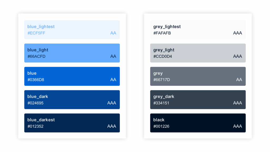
Finally, an essential aspect of creating accessible colour systems is allowing your team to reference the system when needed, so everyone is clear about proper usage. This not only avoids any confusion but ensures that accessibility is valued within your team. Being able to clearly call out the accessibility rating of a specific colour combination within a UI kit or design system is incredibly effective.
Here’s an example of how to document background-to-text colour combinations and the accessibility rating of each combination.
These are just a few tips to make your product more accessible. While these guidelines may seem a little daunting at first, there are tons of resources out there to help you along the way, and when in doubt, don’t hesitate to reach out to a designer for help.
Why not email hello@little.agency or call 0113 828 0000 to find out how we can help you to transform your content marketing.
Still the same great data driven services, but now with a different name


