6 August 2021
The do’s and don’ts of email marketing
Read More

There’s no doubt that to create a new Olympic games logo is one of design’s toughest branding challenges. How can you:
…All in a design simple enough to work in a number of different environments, from wayfinding signage, giant billboards to mobile devices?
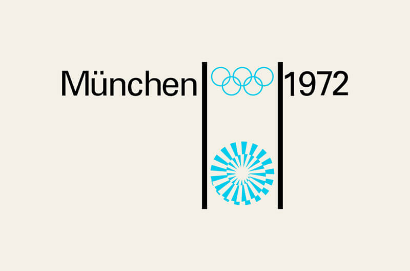
From its earliest beginnings, each olympic logo has sought to try and show signs of patriotic pride. In the year of 1972, the host nation of West Germany was confident enough to try a different approach. Instead, creating a geometric logo designed specifically to avoid reference to any specific country: making clever use of a spiral effect of the sun to show rays of optimism which quickly became an important message during the games that year. However, the brand direction did not come without controversy. Many people felt the logo was too abstract, seeming detached from the events and difficult to relate to the culture of its host’s nation.
No matter what came next, the branding for Munich 1972 will always seem to remain current, informative and highlight what influence good iconography can bring to a brand’s identity. Developing more than 180 icons, each represented a different sport, while also providing clear signage for both the athletes and visitors attending. The simplicity of the design is what makes the branding so timeless, and set the standard on how to make the games accessible for people visiting from around the world.
Alongside designing the logo and icon-set, Munich 1972 also marked the first ever Olympic mascot in the form of Waldi, the striped Dachshund dog. Woof!

The 1968 Olympic Games were hosted by Mexico City, Mexico – marking the first time the summer games were awarded to a Latin American country. And for Mexico City, it was an opportunity to show the world that the nation was just as notable as other cities such as London, Berlin, Rome or Tokyo.
Among many ground-breaking aspects of the games that year, the brand’s identity would become one of the most famous in Olympic history. Going on to set a whole new standard for what future games could achieve. The brief was to create a visual identity that would tie together everything that was going on during the games, and to really sell the city to attendees that were visiting for the first time.
Most Latin American art features bold lines, geometric shapes and bright colours. Lance Wyman (who was the designer responsible for the game’s identity) noticed that it was very similar to contemporary art made by artists at the time. Focusing on optical art which looked at how geometric shapes and contrast gave the impression of movement. Wyman used this to connect both Mexico’s heritage and contemporary design to create the hypnotizing logo. The design Wyman created really represents Mexico of that era and was a fresh new look to the industry, mixing the old and new to create a compelling design.
Alongside designing the logo and typeface, Mexico 68 also developed an extensive icon set that helped millions of international visitors navigate through Mexico City’s rail systems with ease.
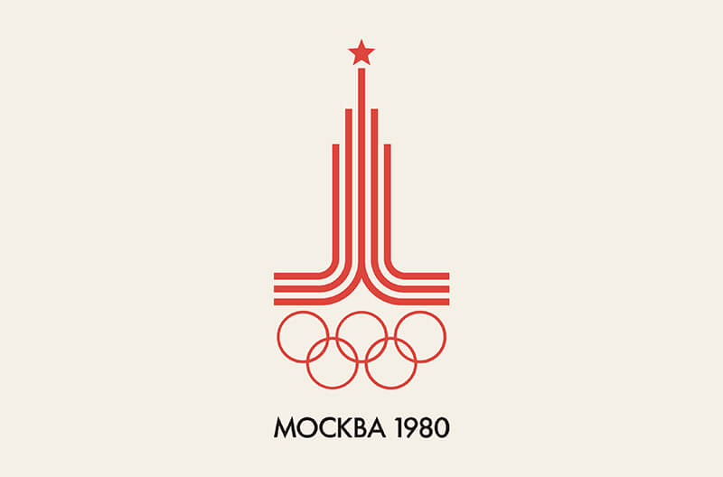
Being hosted during the height of the cold war, the Moscow 1980 Olympics Games came at an important time for the Soviet nation, a way of building back Moscow’s reputation after the United States and 68 other countries boycotted the games that year.
Instead, the organisers that year commissioned designer Vladimir Arsentyev to create a logo which was uncompromising towards the Soviet nation’s ideology. Most recognised when looking at the red star placed above the 3 parallel lines representing the Kremlin towers and the Olympic rings matched in a strident red reflecting the sovitet’s socialist values. The brand’s direction was received with much criticism, with many athletes and visitors feeling intimidated to attend the events. The geometric tower topped by a star is a good example of how too much focus on patriotic pride can have a detrimental effect on successful, relatable branding.
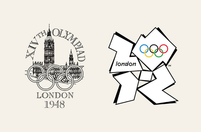
The 1948 games were the first back after a 12 year break after World War II. They became known as the ‘Austerity Games’, as they took place in the aftermath of the war, meaning the games were almost handed to the United States due to the financial issues and rationing still in place, but King George VI said it could be a chance to build back Britain. London actually hosted the Olympics before in 1908, but logos didn’t really become a thing until the 1924 Games in Paris.
The actual logo for the ‘48 games has a very poster-like feel still, and is more an illustration as opposed to how we know logos now. It feels very cluttered and complicated in the middle section, but the overall shape of it has a nice balance, with echoes of a shield or crest. These games were the first to introduce pictograms for 20 sports and were intended to be used on the tickets, they were also quite illustrative and all sat in a crest shape that links to the logo.
In complete contrast, the London 2012 broke the mould of the traditional logo layout from the previous years, but it received a lot of criticism at the time for feeling dated and not in keeping with the times. The bright pink abstract blocks come together to hint at the year 2012, with the olympic rings situated in the ‘O’. It’s a vast difference to the very formal 1948 logo and with only the rings linking them.
Looking back on it now though, it has become one of the most iconic Olympic logos since Mexico ‘68 one (which we mentioned earlier).
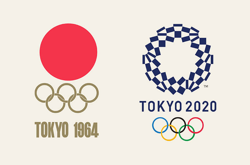
1964 marked Tokyo’s time to host the Olympics, and it celebrated Japan’s progress on the world stage. Nearly 20 years on from the Second World War, they were now seen as a peaceful nation that threatened no one. The logo design was effortlessly simple (even if it felt like the easy option to take the red circle from the flag), but the execution just works. The design for these games seemed to spark a design renaissance in Japan for the years after including architecture, transportation and fashion.
Fast forward 56 years and Tokyo was set to kick off the Olympics again, however COVID-19 had other plans and the games were delayed a year. Then in 2021 they started with no crowds, but still the same emphasis on togetherness around the world through sport.
The logo harks back to the 1964 version in terms of layout and shape, but this time having a more detailed ring of connected shapes, which at first glance looks symmetrical, but on closer inspection has very slight angle changes that actually make it asymmetrical. This may have been an intentional move to show the differences of people around the world coming together as one. The type choice is very clear and easy to read, but personally I prefer the 1964 typeface, and overall my preference is the 1964 logo just because of its effortless simplicity.
Why not email hello@little.agency or call 0113 828 0000 to find out how we can help you to transform your content marketing.
Still the same great data driven services, but now with a different name


